
COLOR, Let's Talk About COLOR
- cambraokellydesign
- Jul 9, 2022
- 3 min read
Color this, COLOR THAT. I AM GOING to get a gallon of paint, NOW WHAT?
There tend to be many questions when a homeowner speaks about color and paint. It can be the hardest part of the design process for many. But why is that? We ALL have certain feelings that correlate with certain colors we gravitate to, but after we finally pick a base color we then have to pick the shade, tint, and hue, all to get that perfect feeling. Not sure if you can relate but it could literally take me longer to choose a color for my walls than it does to finish the entire project.
Just me?
In this blog, I will be diving into relative detail about PRIMARY colors and how they could impact the quality of living before you hit the walls with the paint roller.
While there are still other components of a quality design with painting (that even the sheen of the paint will impact how you see something), that is for another day.
SO LET'S DIG IN!!
WHY IS COLOR SO IMPORTANT?
Color has many facets but overall, color creates a feeling you have and can impact your mood... (That is legit too, I "learn't" it in design school;)
But for real, Color Theory is a wonderful and exhausting process for many designers and homeowners. It isn't just you. I promise.
For instance, here is a quick list of scientific feelings that certain colors in interior space will create, in one's mind...
JUST UNDERSTAND, THAT FOR THE THOUSANDS OF PAINT SWATCHES EACH AND EVERY COLOR HAS ONE OF THESE BASE "PRIMARY" COLORS TO THE UNDERTONE. THIS IS WHY WE WILL GO TO GROUND LEVEL TO UNDERSTAND THE CORE OF COLORS.
RED'S
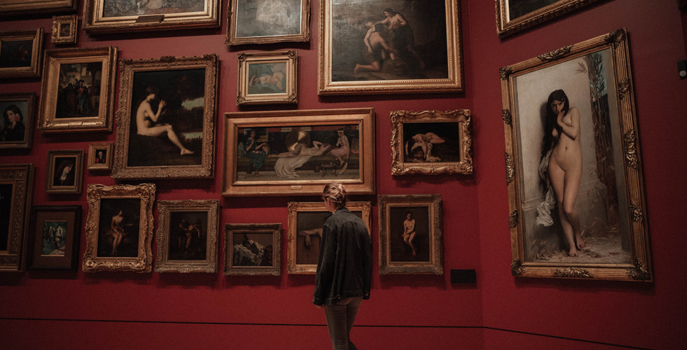
RUN! Just kidding, don't do that but that is what the color possesses to the mind, much of the time.. The color red is also one of the first colors to be named in history and it's no wonder why... The color RED sparks up energy, excitement, and urgency for a fast pace life(it can also make you hungry). This is why we see red velvet drapes and seats in theaters or in the alleys in China Town or Vegas Casinos. There is a very real feeling the color red does to the mind.
However(there is a "however") the primary color has many variations and they each have a wide range of emotions that would attach to certain spaces.
Even Pinks are energetic and playful, which creates excitement in a space for the mind to wonder with imagination(think of Dollywood and ice creameries).


YELLOW'S
Sunny, happy, and energized are a few emotions that come to mind with the primary color yellow. Think of a tea party.
Pretty simple and straightforward on this one.
Just think of what the sun does for you.
Yellow just so happens to help the mind be on it’s “sunny side” of things. If choosing bright yellows in a space it will add energy and playfulness but a muted yellow can create an uplifting calming space.


BLUE'S
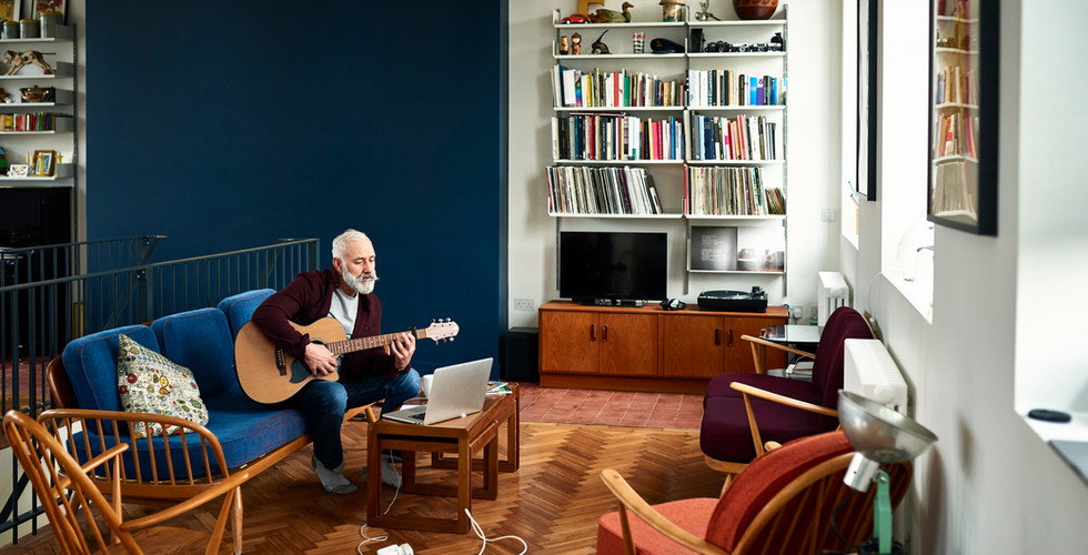
Calm, serene, universal. BLUE’S can become green and between the two, they are the most widespread colors in the design.
There are many tones and shades of BLUE’S that can generally fit just the mood you are in need of for a space. Think of a landscape painting. The base colors of land and sky.
If you love going to the spa, a blue undertone in a space, might just be the perfect balance for a uplifting and calm mood. Or, you can create a space that is a reflection of period living, nautical style and so many in between.
SO, LETS GET ROLLING THOSE WALLS!


3 COLORS!? That wasn't so bad, right?!
Well, as easy as that seemed it becomes much more advanced as we add HUES and TINTS and then secondary colors into the mix. They each play roles in COLOR THEORY and in the next blog.
SO STAYED TUNED!
CAMBRA O'KELLY DESIGNS
Comments